AaAaAaAa
One system.
Six products.
How to make TSC Suite cohesive and cut down project delivery timelines?
- Company
- The Sustainability Cloud, LogicLadder
- My role
- System Designer & Owner | Researcher
- Scope
- Global Design System
- Products
- Netzero | Water | Enviro | Energy | CBAM Exporter | Value Chain Partner
In a hurry? Read the summary of the case study instead
TLDR: Summary
- Problem
- Six products, no shared rules, and rework on every change.
- Role
- System designer and owner. I set the shared rules, documentation and design checks.
- Status
- In use across all six apps.
Scattered product identity, confusing buttons and ever-extending timelines.
Hurting business as well as clients.
SaveSaveSave
One button. Different behaviour.
PM→Dev→Rework
No rules. Pushed timelines.
The design question.
How can I make a global library catering to all our current as well as future products, and reduce the iterative cost and effort of the developers?
Looking back to move forward.
The facts.
“You can’t connect the dots looking forward; you can only connect them looking backwards.”Steve Jobs, Stanford commencement address, 2005
What did we know?
- There were six products, and there could be more in the future.
- Mostly the same workflows: dashboards, forms, buttons.
- Iteration was happening when there was no visualisation.
- Everything needed to be checked on staging.
What have we learnt?
- The solution has to be flexible and scalable.
- Never let one type of workflow have too many different representations.
- CRUD actions should share a common operation method.
- Dev handoff should have a mandatory step: sign-off from post-design QA.
Same behaviour.
Personalised theme.
I audited the existing products, identified their shared patterns and differences, and established a common foundation with product-level visual themes.
The theme changes. The rules don’t.
Netzero overview
+ Create reportCard title0,000
Card title000
Card title00%
Primary actionSecondary action2 items need review
- Shared layout and parts
- Product colour · Netzero
- Shared status colours
Shared foundation.
Consistent across all six products.
Roboto typographyButton types and statesShared layouts and grey surfacesLink and status meaningReusable componentsDocumented usage rules
Same in every productProduct themes.
Each product kept a colour identity connected to its subject. Water uses blue, Netzero green and Energy orange. The theme can change. The component behaviour and meaning do not.
Different in each product
The principle: standardise the experience, not the personality of every product.
Built on universal design thinking
The system was not about making every screen look identical. It was about reducing what users had to relearn between products, while using familiar cues to make interfaces easier to recognise and interpret.
External consistency
Let the product reflect the world it represents.WaterNetzeroEnergyEnviro
Mimicry & Jakob’s Law
Feel like the apps people already use.Same signals everywhere
One signal. One meaning.Netzero & 6 Other ProductsCancelDeleteSave
The distinction: product colours can vary. Functional meaning must not.
Fun fact ✦
Colour decisions
Grounding product identity in shared associations.
To understand which colours people naturally associated with each product, I asked ten colleagues across Product, Engineering, Sales and HR to share their associations. This was an internal stakeholder exercise, and it helped inform the product colour direction.
Colour carries a feeling.
Imagine an app about water that looks orange. It feels wrong. Each product's colour should feel coherent with what the product is about.
Water✕ Feels wrong
Water✓ Feels right
A system beyond buttons and colour.
I have also designed accordions, tables, pagination, radio buttons, banners, overlays, modals and many more components. The details are confidential, so let’s walk through them in a 1:1.
From disconnected screens to one shared foundation.
The design system introduced a consistent visual and interaction foundation while preserving the Netzero product identity.
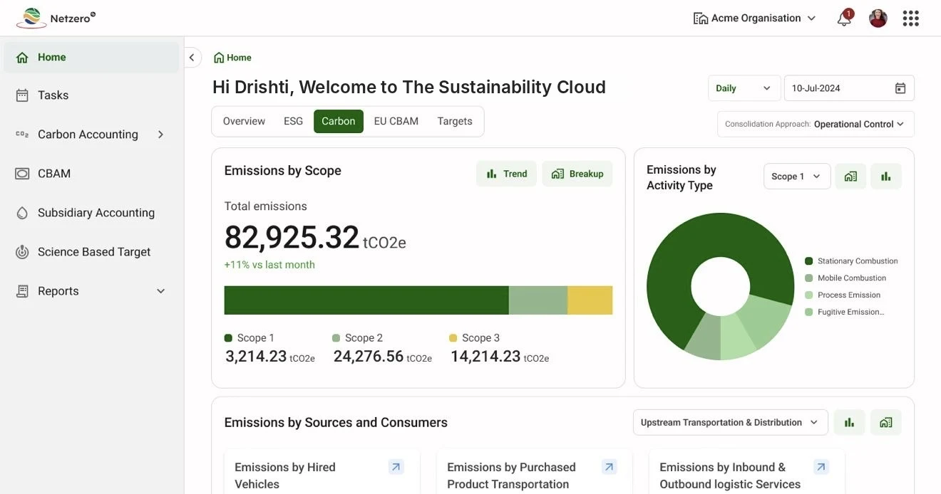
AfterAdd assets/projects/netzero-after.webp
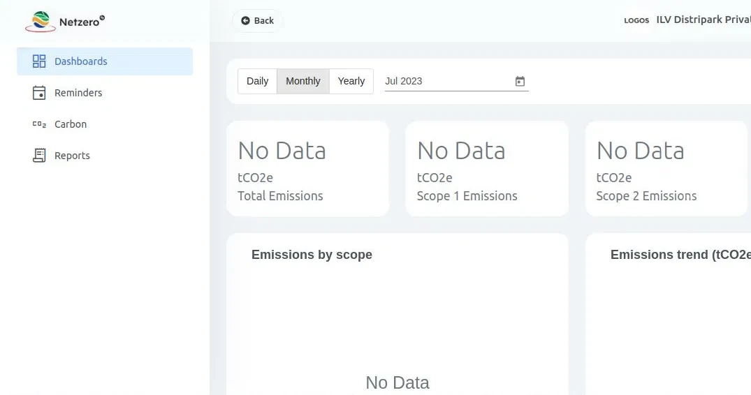
BeforeAdd assets/projects/netzero-before.webp
Reuse needs rules, not just reusable components.
I documented how the system should be applied and introduced design checks during implementation. I also defined a process for adding new components, so the library could evolve without losing consistency.
- 01Choose the product and the action
- 02Select an approved component
- 03Apply the product theme
- 04Review against the design guide
- 05Design QA and release
The workflow, written down in the design guide.
Less guessing.
More consistency.
Faster changes.
The shared system is in use across all six products, with some parts still being migrated into the library. Designers and developers have a common set of rules to reference when building and reviewing interfaces.
5+→~1
working days for some small UI changes, before and after reusable patterns were introduced.
Same spacing. Different look.
In Figma and on staging, the product looked very different even though the pixel spacing between elements was exactly the same. After cross-checking several times, we found the text line height was not following the standard. One small change to the formula made a big difference to the overall UI.